Custom Logomark and Brand Identity
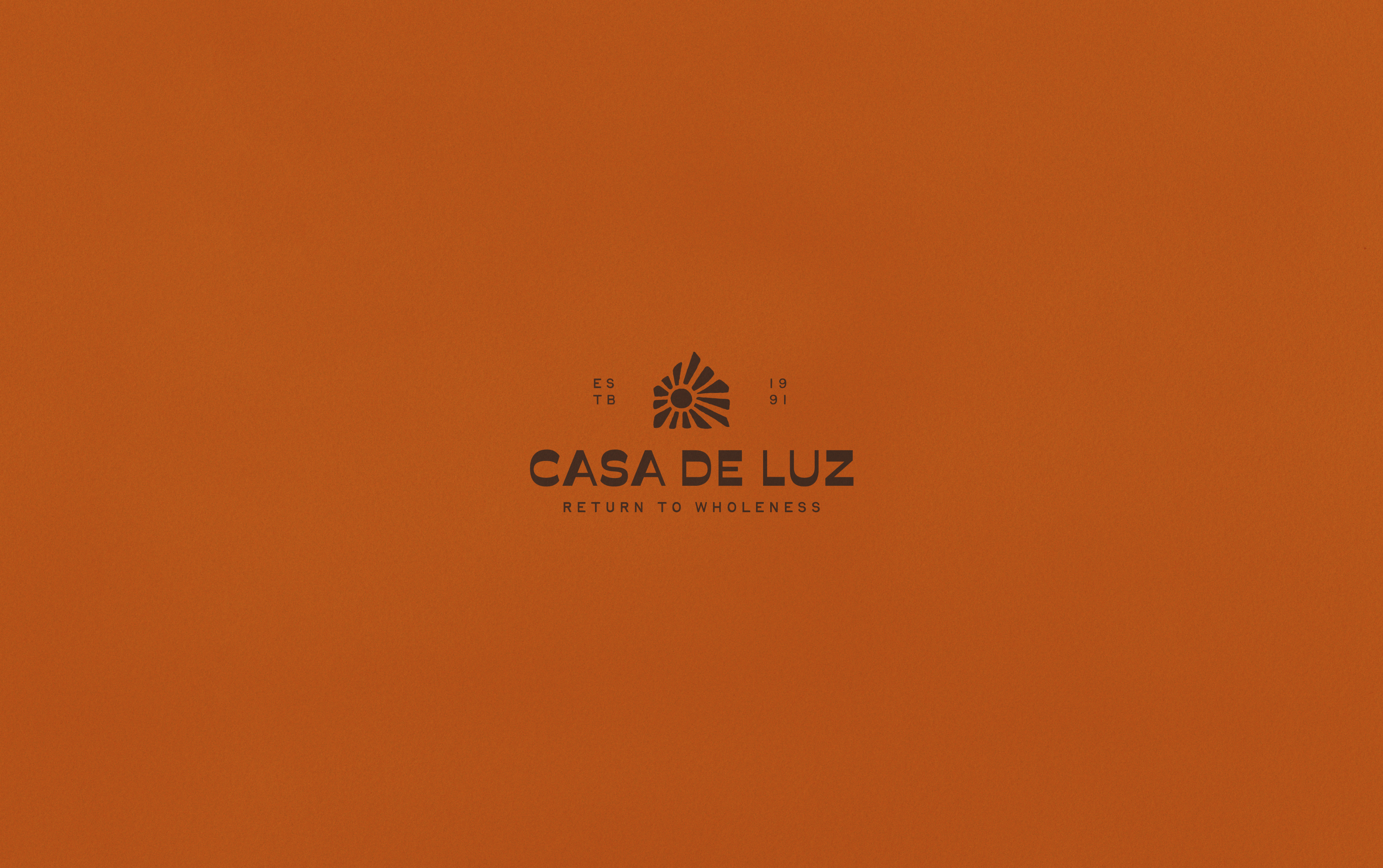
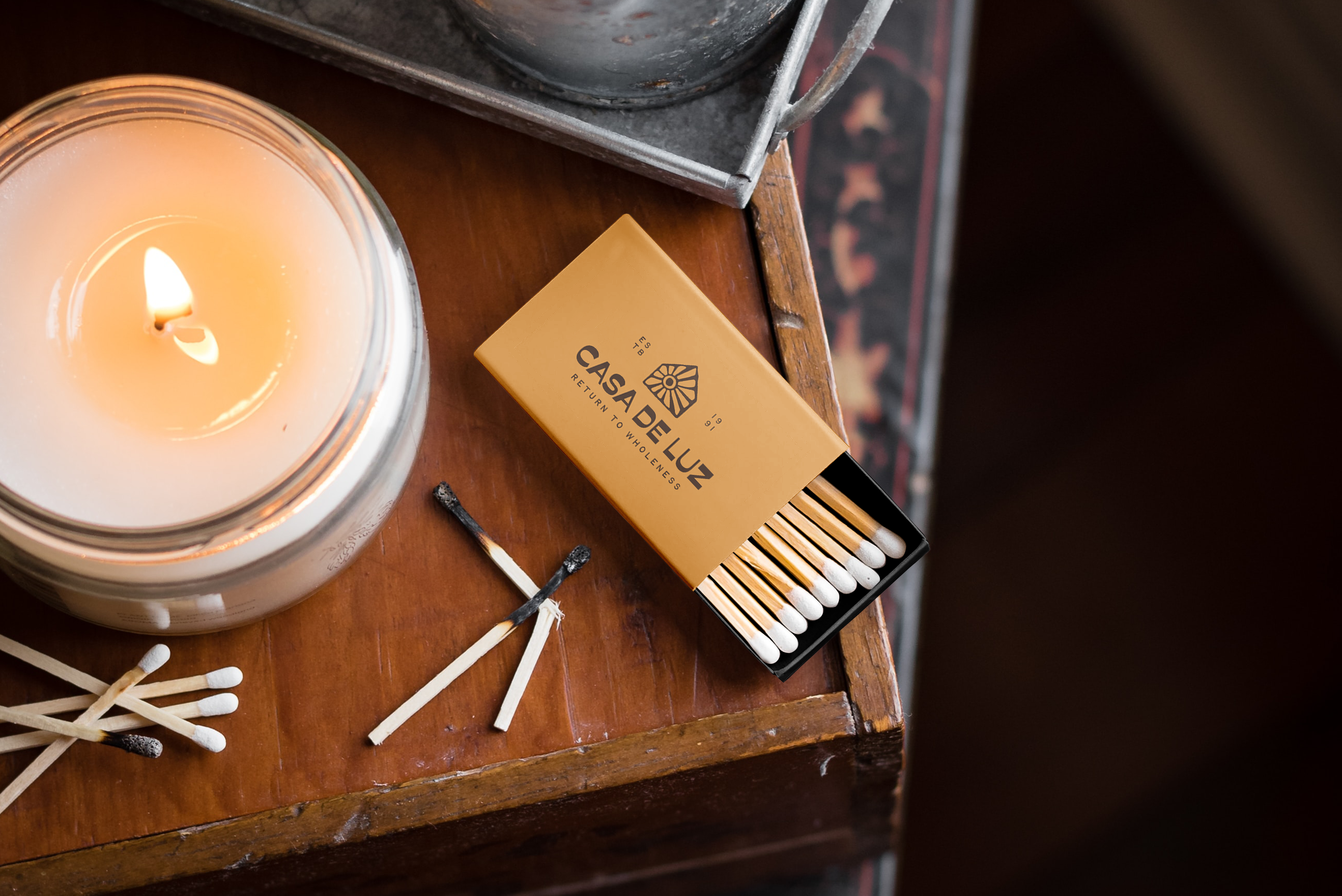
Casa de Luz
Casa de Luz is a plant-based community space in Austin, Texas. More than a restaurant, it serves as a gathering place rooted in ritual, nourishment, and connection. While the space has evolved over the past 25 years, its visual identity no longer reflected its warmth or cultural relevance. This self-initiated refresh repositions Casa de Luz as a contemporary sanctuary grounded in community and conscious living.
The objective was to evolve the brand while preserving its spirit. The identity needed to feel modern without becoming sterile, and culturally grounded without relying on trends. It also had to function seamlessly across signage, print, packaging, and digital touchpoints. The focus was clarity, cohesion, and longevity.
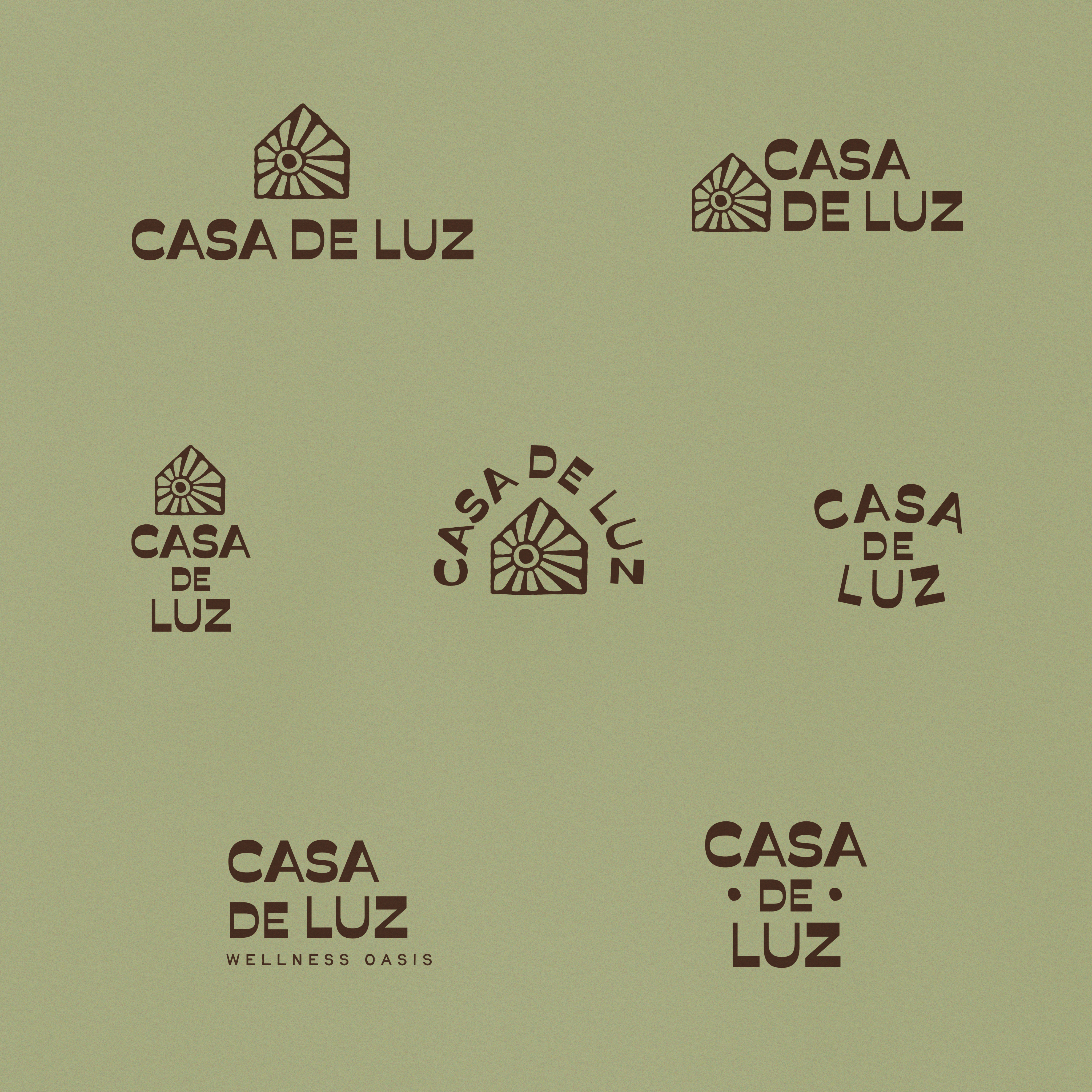
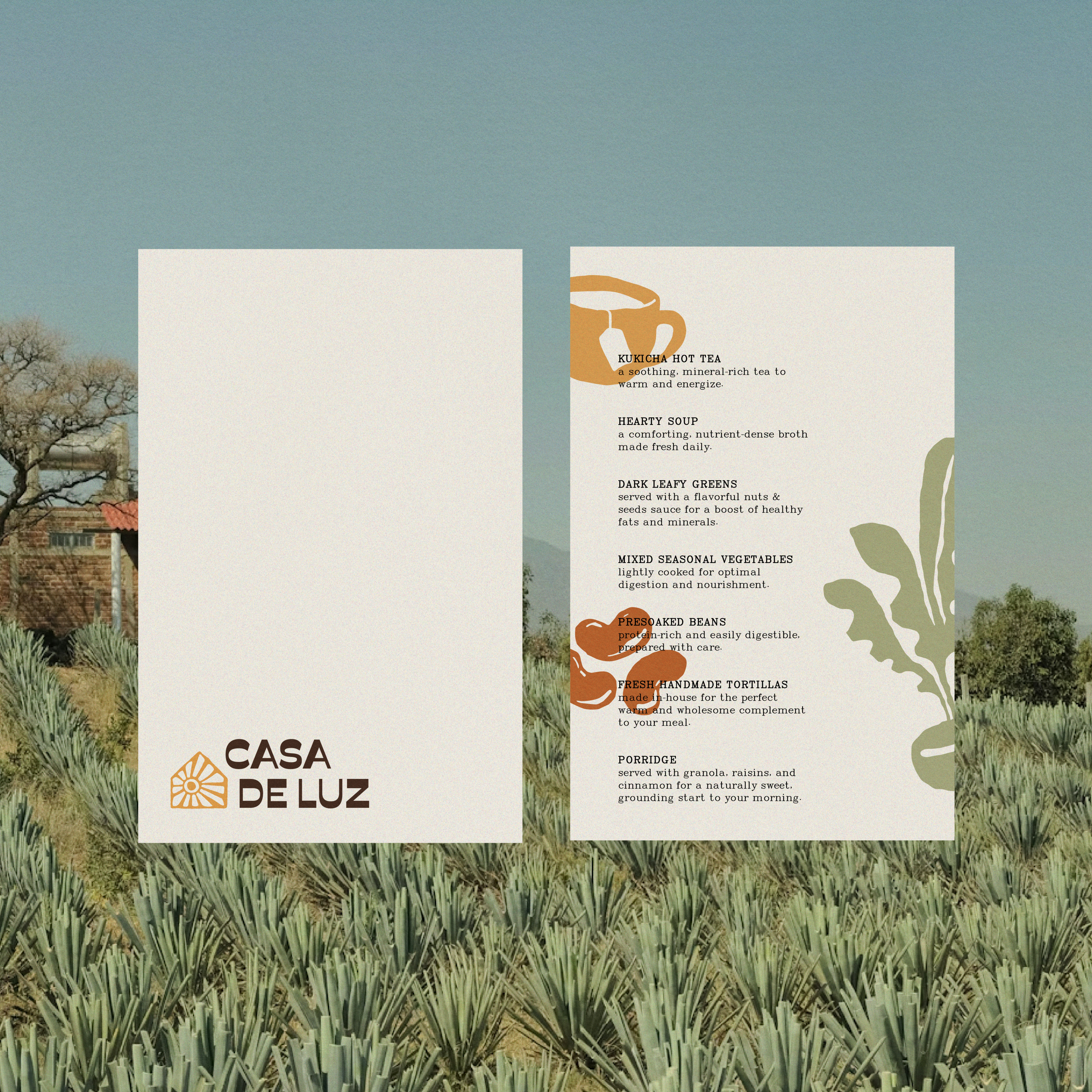
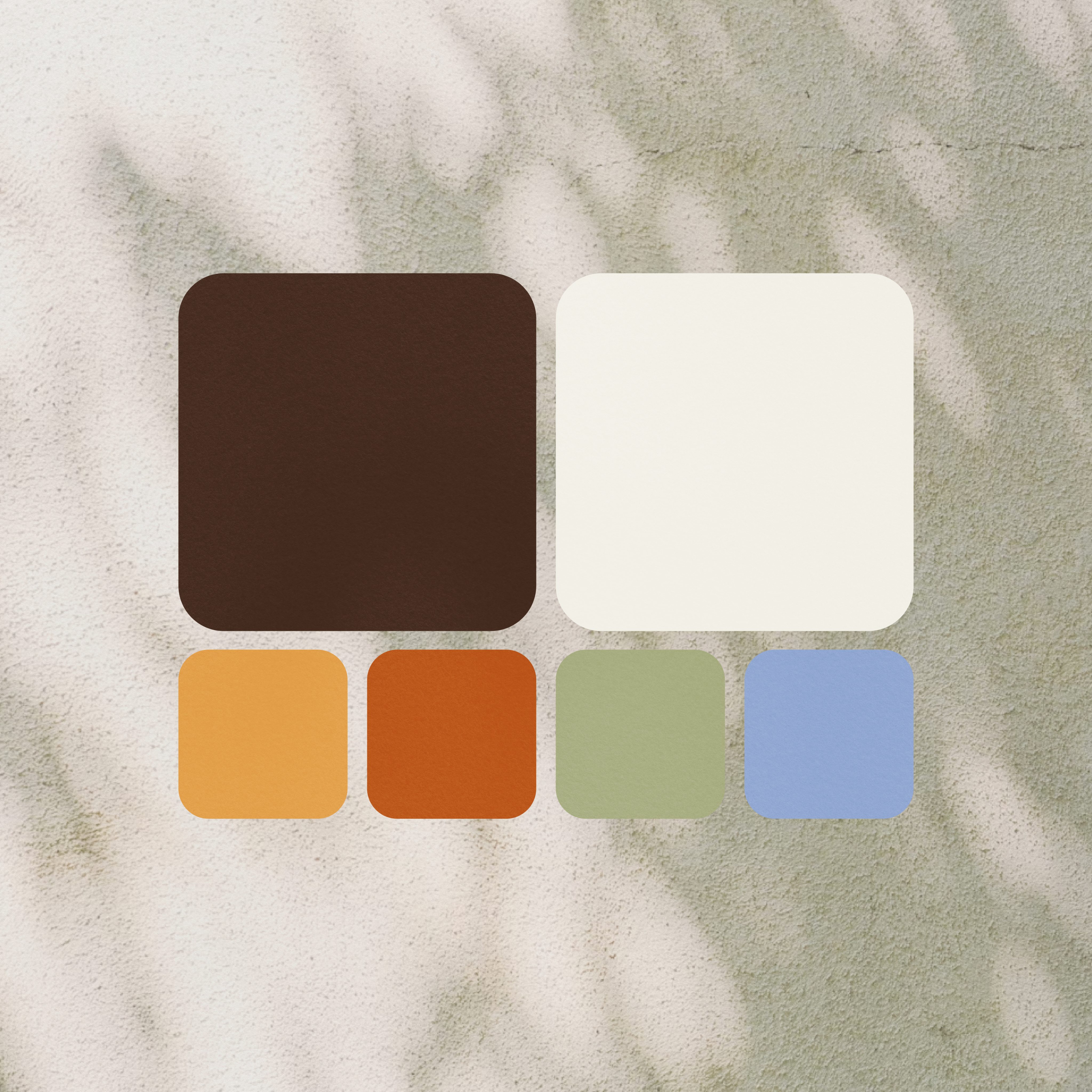
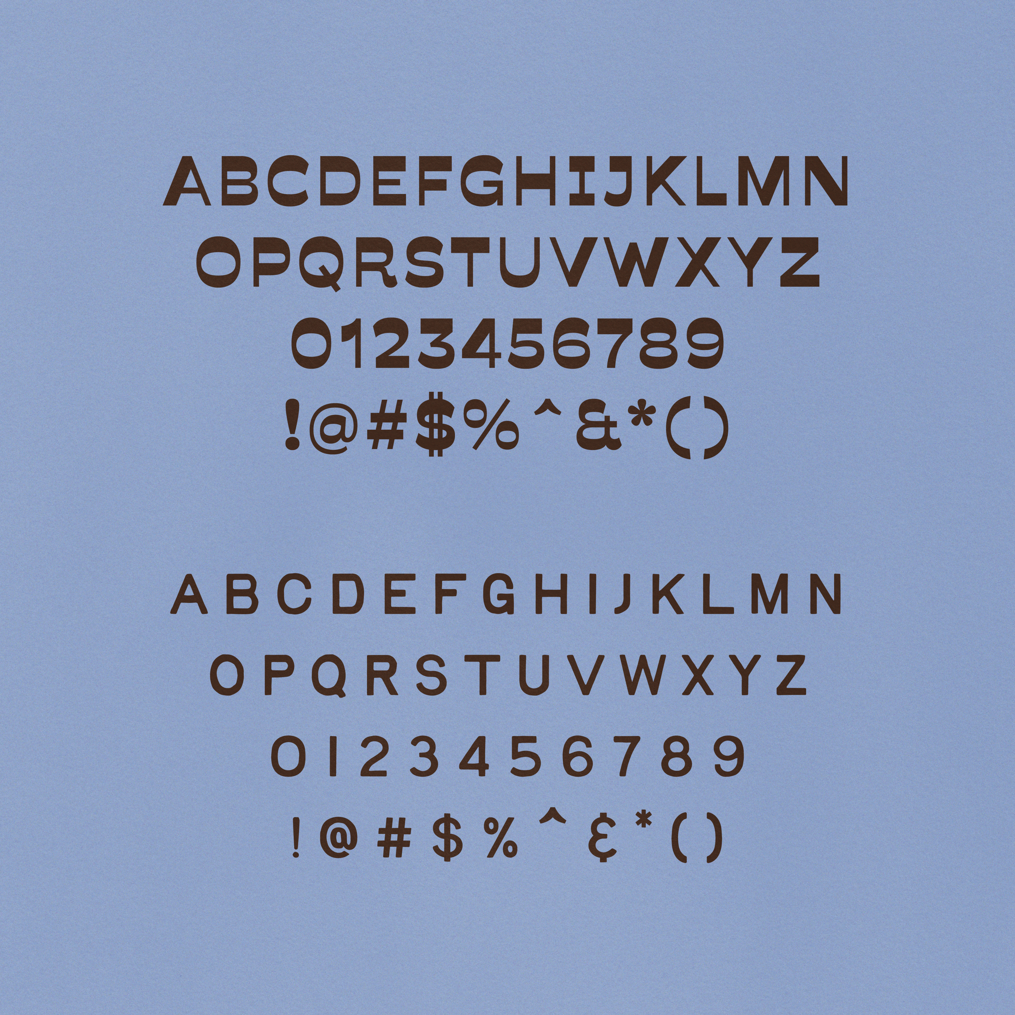
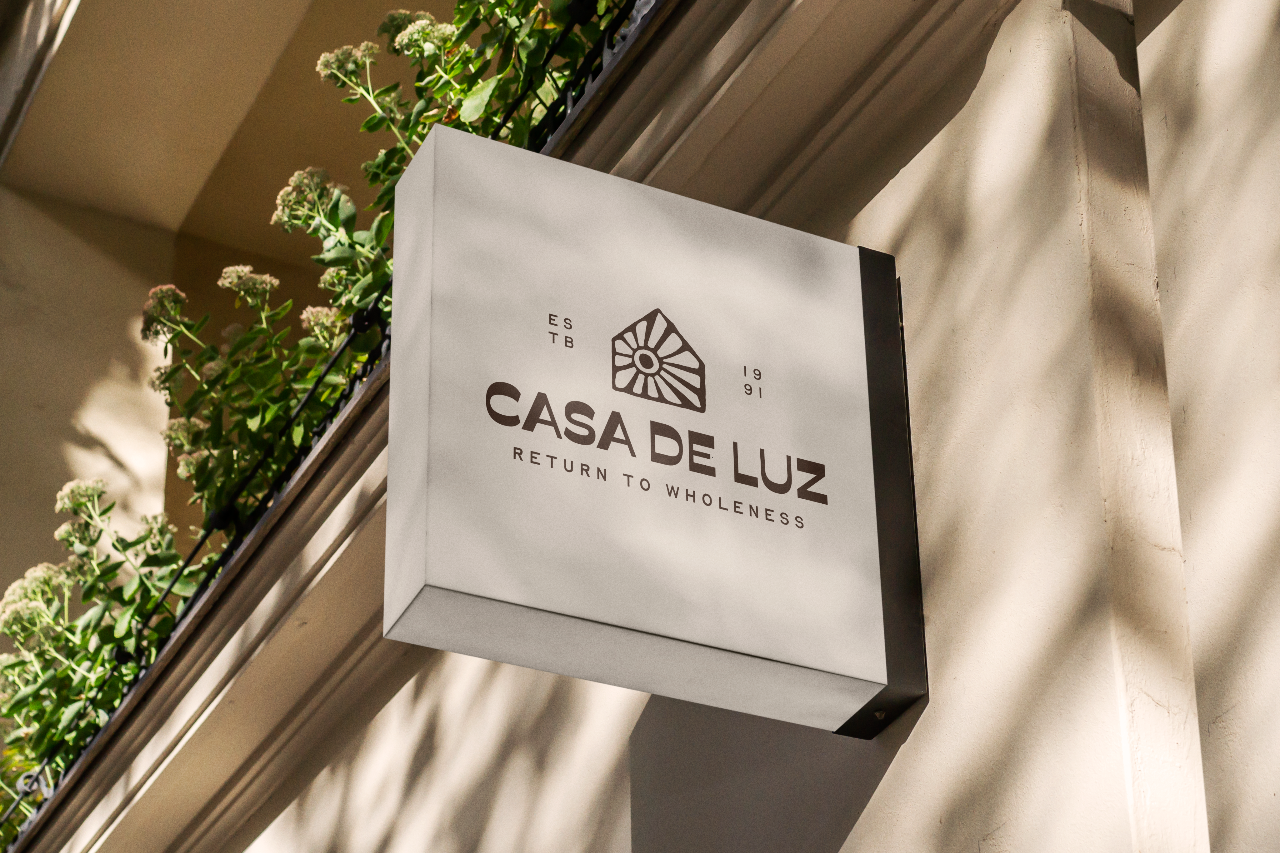
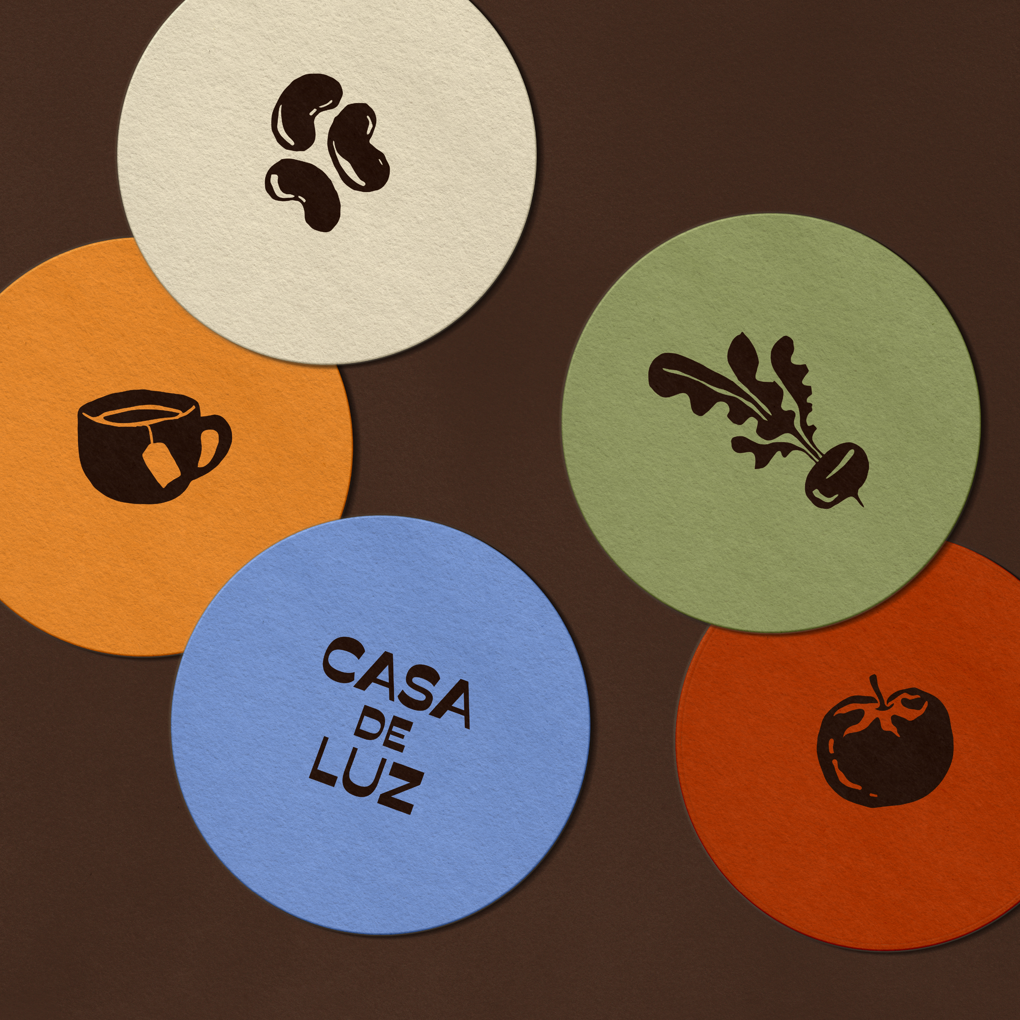
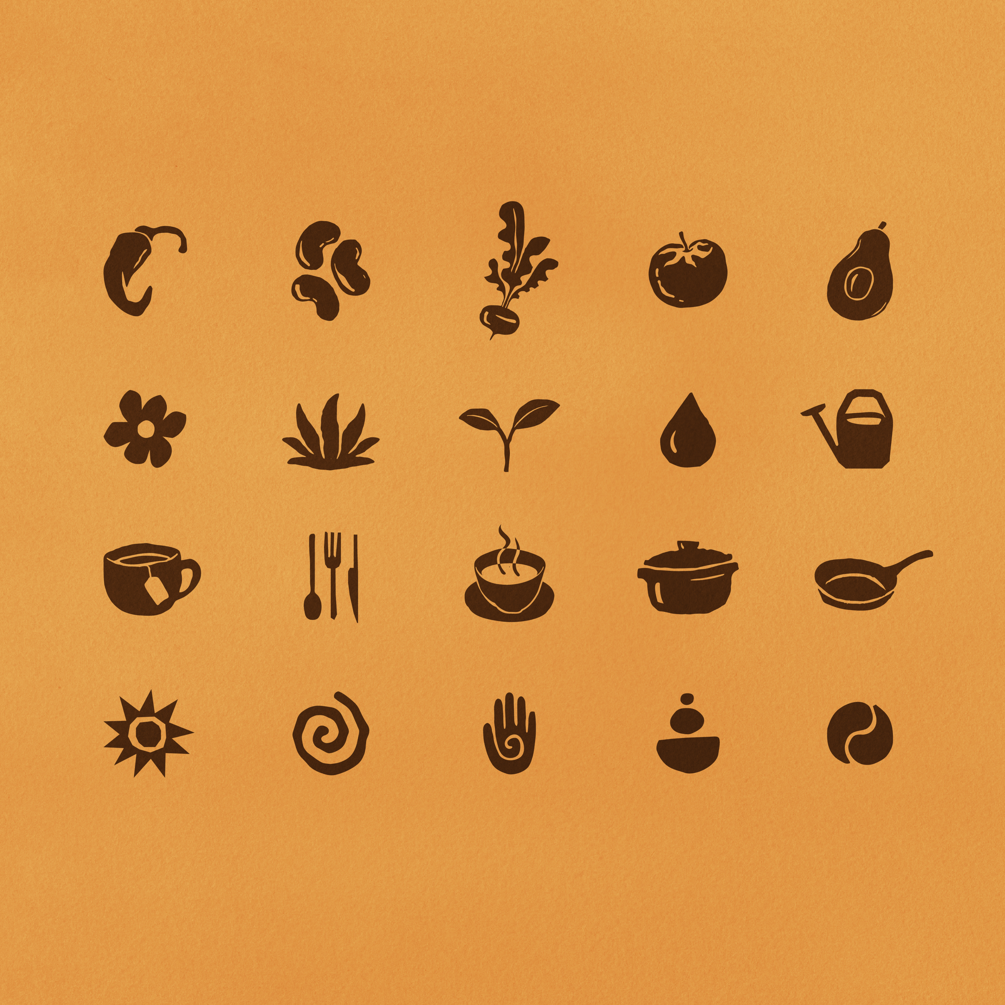
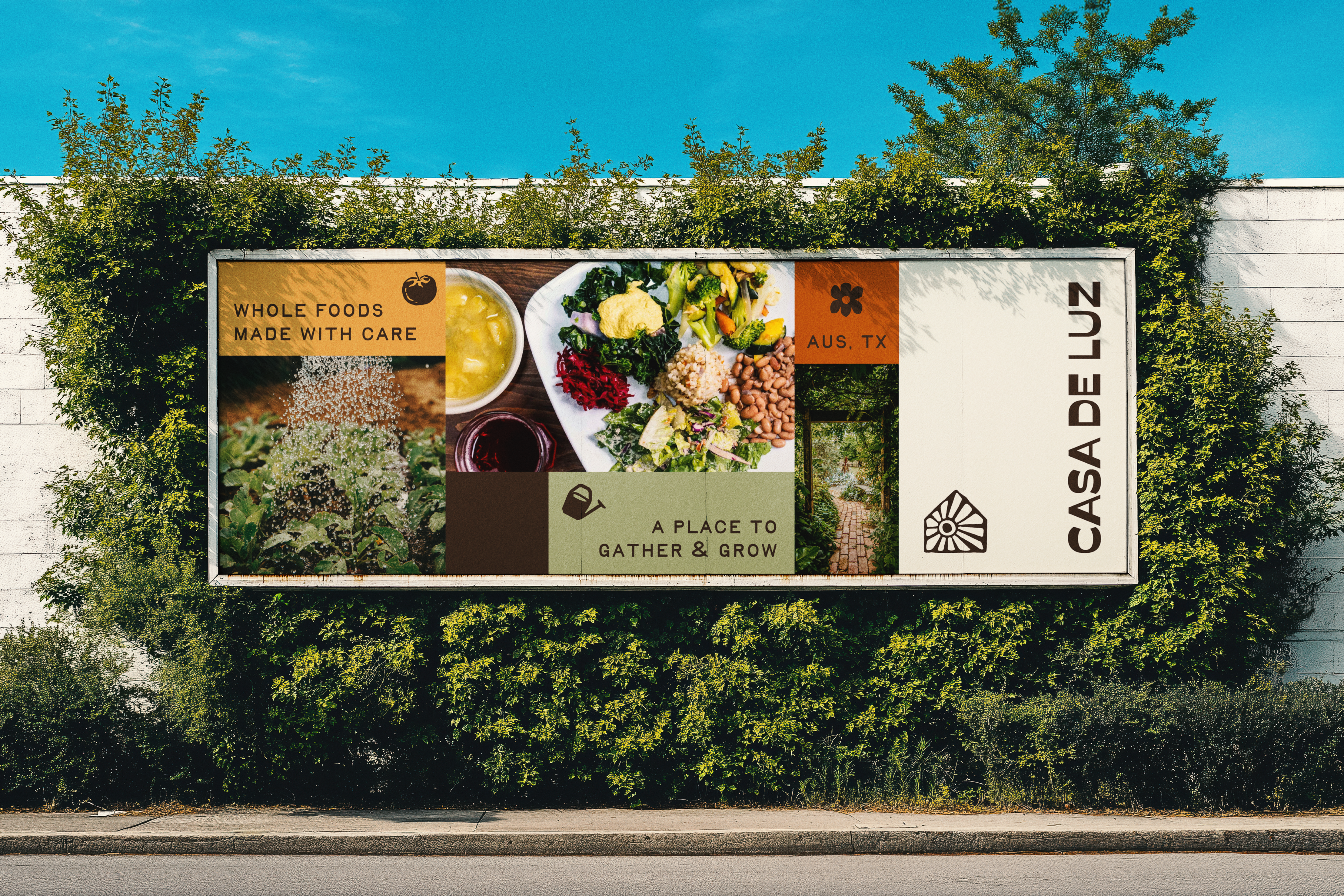
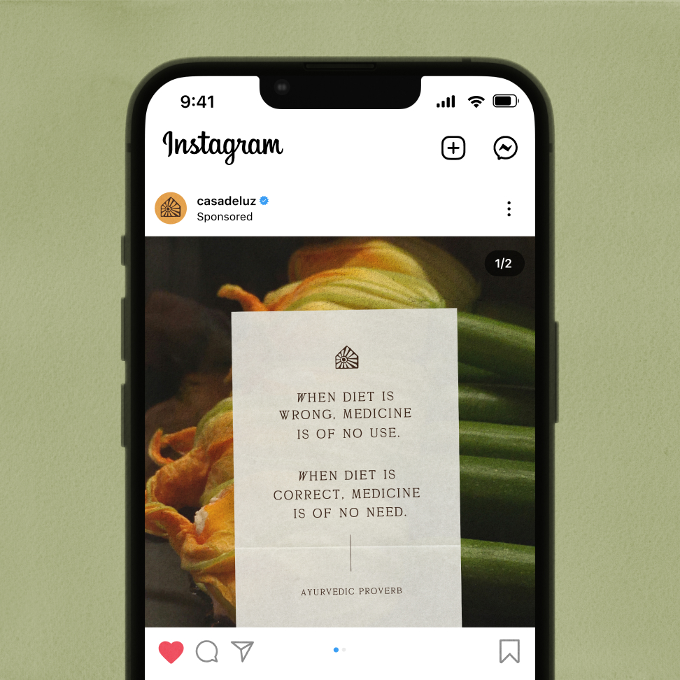
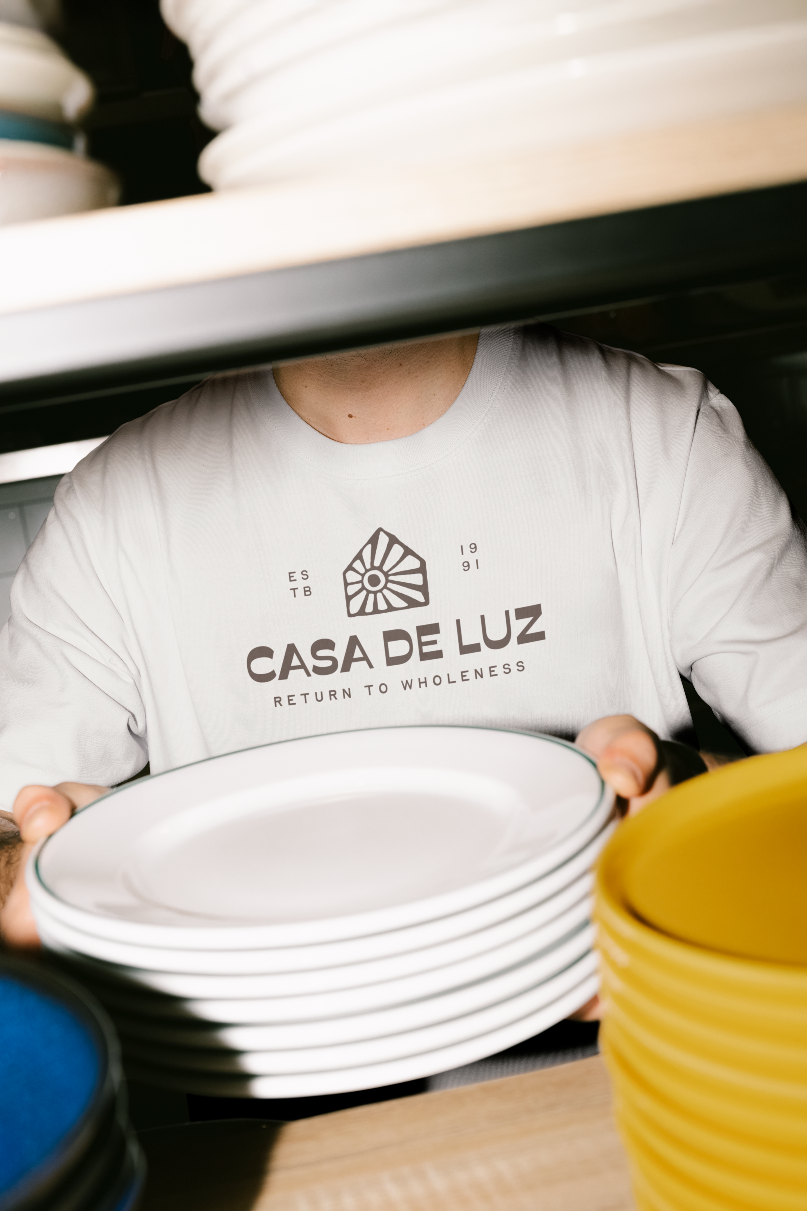
Casa de Luz translates to “House of Light.” The primary mark is intentionally direct: a house form with a sun radiating from within. The sun does not rise above the structure; it emanates from inside it. The symbol reflects nourishment, connection, and transformation that begin within the community and extend outward. The visual language is rooted in earth-based color and tactile form. The palette reflects soil, produce, and sunlight. Hand-drawn, stamp-like illustrations of fruits and vegetables reinforce the human scale of the space and its focus on whole food.
Role:
Brand Designer
Scope:
Strategy, Visual Identity, Illustration, Art Direction

Other Projects
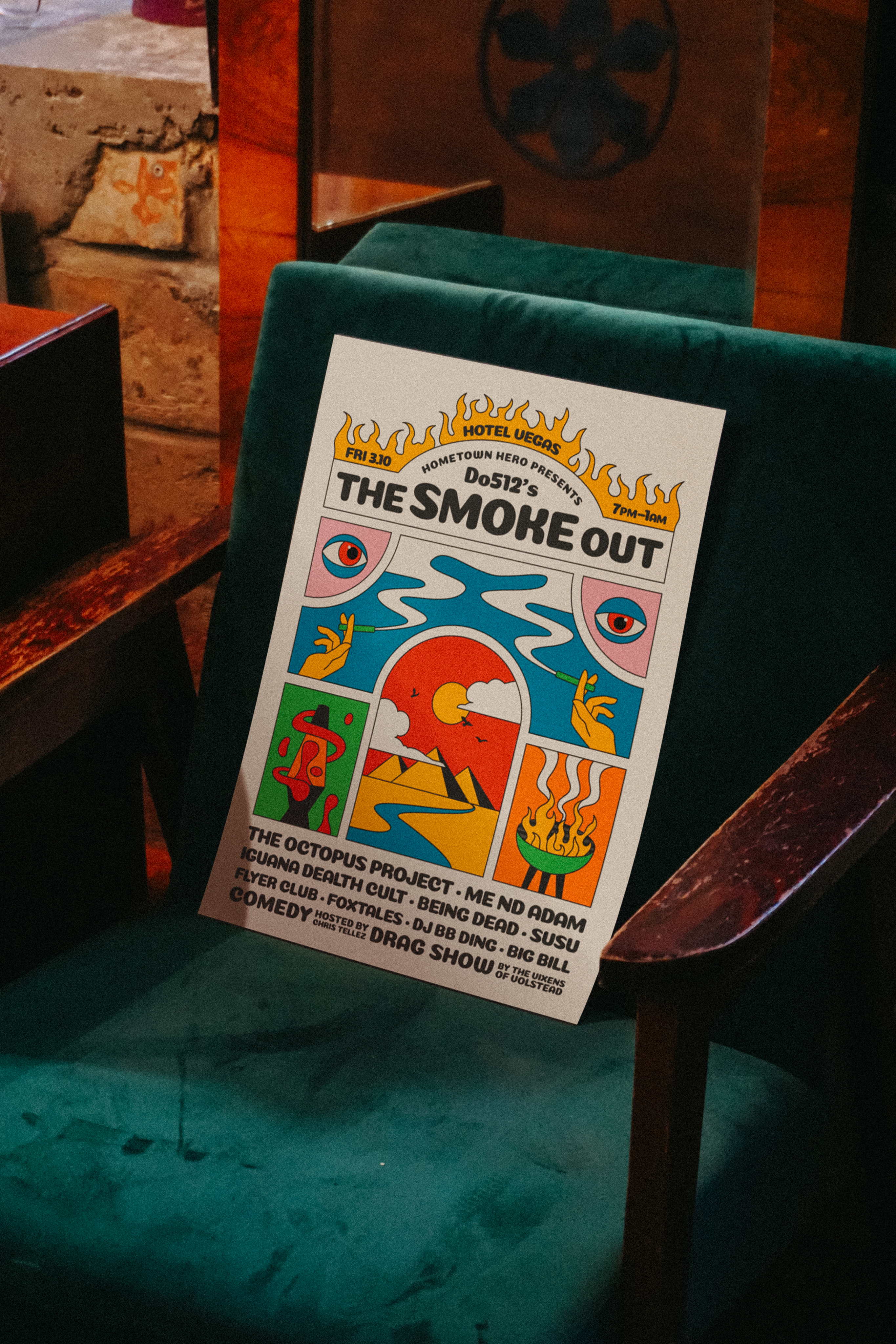
SXSW
→
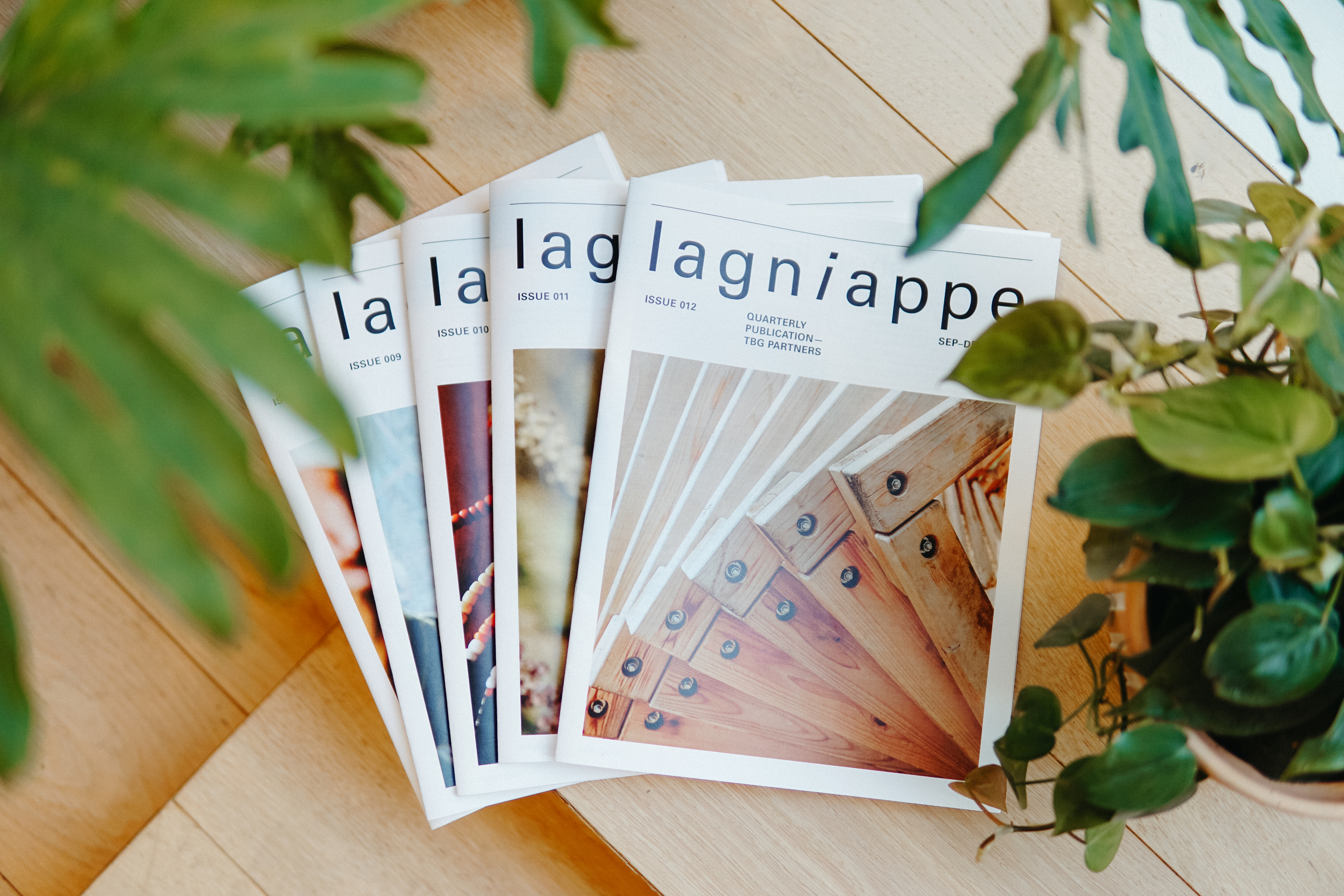
Lagniappe
→
Risograph Illustrations
→
LET’S CONNECT
Menu
Work
About
Contact

Custom Logomark and Brand Identity
Casa de Luz
Casa de Luz is a plant-based community space in Austin, Texas. More than a restaurant, it serves as a gathering place rooted in ritual, nourishment, and connection. While the space has evolved over the past 25 years, its visual identity no longer reflected its warmth or cultural relevance. This self-initiated refresh repositions Casa de Luz as a contemporary sanctuary grounded in community and conscious living.
The objective was to evolve the brand while preserving its spirit. The identity needed to feel modern without becoming sterile, and culturally grounded without relying on trends. It also had to function seamlessly across signage, print, packaging, and digital touchpoints. The focus was clarity, cohesion, and longevity.
Casa de Luz translates to “House of Light.” The primary mark is intentionally direct: a house form with a sun radiating from within. The sun does not rise above the structure; it emanates from inside it. The symbol reflects nourishment, connection, and transformation that begin within the community and extend outward. The visual language is rooted in earth-based color and tactile form. The palette reflects soil, produce, and sunlight. Hand-drawn, stamp-like illustrations of fruits and vegetables reinforce the human scale of the space and its focus on whole food.
Role:
Brand Designer
Scope:
Strategy, Visual Identity, Illustration, Art Direction

Other Projects
SXSW
→
Lagniappe
→
Risograph Illustrations
→
LET’S CONNECT